Honestly, this idea is legitimately pretty cool. Not only it fits with Newgrounds being this place for new talents to get their name out there, but I already found a ton of cool stuff and insanely talented artists that went under my nose, in fact, I think this works far better as a frontpage suggestion than the actual BBS FP suggestion thread.
However, the way this is implemented as of now feels a little too intrusive
My main problem being the fact that my "Latest From Your Friends & Favorites"/Follow List is at the very bottom, and I have to scroll quite a bit to get there, when I believe that my follow list should always be at the top, or at least the 2nd thing I see after the frontpage/events banner
At times I just don't feel like seeing new stuff, and just want to stick to my followers list, and I think that making this simple change, or simply giving the user an option to minimize the tab would already help a lot to sell this new feature.
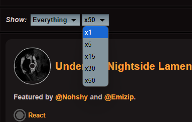
The other suggestion I have, is that instead of having a list for the "Show", you could just have buttons instead, but that's more of a suggestion than a necessity.
However, as much as I don't like how things are implemented right now, I sincerely love this idea, and I'm glad that this place is being run under people that genuinely care over their community and website, and I could not be more grateful for all the effort that goes under keeping Newgrounds running, specially when it comes to introducing new people to the community.
I'm excited to see what new stuff you guys are working on next, best of luck to everyone.


