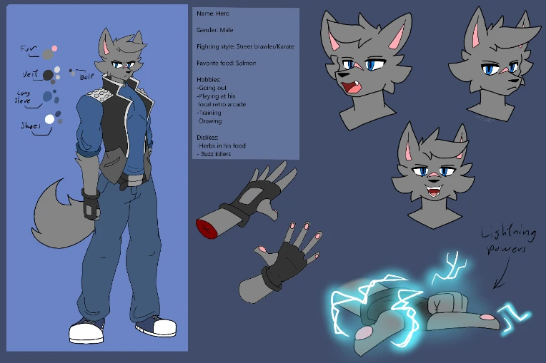
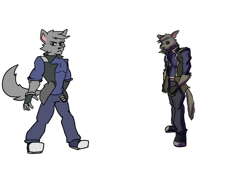
I'm surprised your mutuals would tell you that the design for your character is too simple. I think as far as an animation-friendly design, it has a moderate amount of detail. I use the term "animation-friendly design" because, as others have been saying, animation lends itself to streamlined designs that must be drawn over and over and over. I see the design you shared as fitting right in.
To the point of @thatguyfromshcool , color is a very important aspect, and perhaps that may have been what stood out. What I think is important in color palettes is contrast.
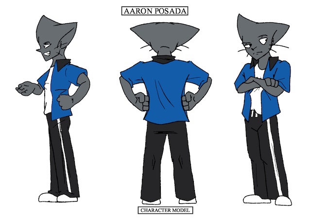
Take a look at one of my characters here for comparison, I think it's a design that may be helpful since it has a palette in a similar range as yours-- as well as this character also having electricity superpowers within my own animations lmaooo

Take a look at the bottom half... I could have put jeans on this character, but I was too scared that it would visually blend in with his blue shirt in a way that was off-putting. I opted instead to use near-black adidas-style pants. Even though the cat already has a shade of gray for the fur, the much darker shade for the pants separates the two enough that they stand out as their own separate elements, all the while keeping the blue shirt as the most striking piece.


