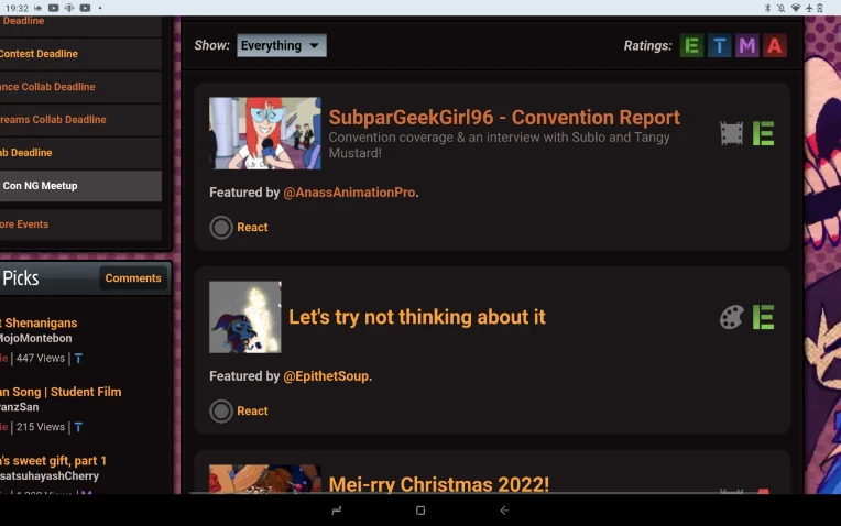
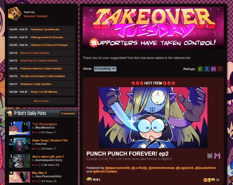
I would frontpage the most Turd of the Year submission ever for the sillies, but I never have gotten Supporter for a long time.
I'd suggest making it a bit smaller because it takes a lot of the screen, specially on mobile. Overall it's a really great addition to the supporter features 👍
At 10/8/24 12:54 PM, TomFulp wrote:At 10/8/24 12:52 PM, Aalasteir wrote:At 10/8/24 12:50 PM, TomFulp wrote:At 10/8/24 12:45 PM, Aalasteir wrote:At 10/8/24 12:13 PM, DrSevenSeizeMD wrote:This is better than Christmas.
100%! The Funny Month is full of surprises!
I absolutely enjoy the new feature. It's great to see people being able to showcase what they want, which is very cool. However, when I tried to click 'View All,' I was greeted with this message.
Is that link working for you now if you try it?
Thank you so much, Tom! It works now! You are awesome!
Thank @PsychoGoldfish, he's doing the work there!
@psychogoldfish is God.
Got it 👍
| It is possible to commit no mistakes and still lose|||Love belongs to Desire, and Desire is always cruel.||||
I will say, I do like this Idea, However I do think the List could have been a bit shorter with a button that allows us to view more submissions. It's really Looooong, Too long.
What if, what if something featured one week cant be featured again for the rest of the foreseeable weeks.
It would prevent certain works from being featured over and over again due to them being memeable and put a highlight on works that were overlooked the weeks prior that deserve more love.
Ok i did if i wish someone can support My videos too :)
YOO this is incredible! What a great surprise!!
The thing I boosted got 2 new favs and a dozen or so views in the short moment it was at the top! Seeing other people enjoy the thing I recommended is so cool!
As a numbers guy, man I would love to see how many views/favs/votes/reviews are directly attributed to Takeover-suggested content - both as a poster and as an artist. But not sure NG can easily track attributions like that?
Like others, definitely would love if artists got notified if someone else posting their content or engaging with it on a Takeover post. Or have a way to just see my past takeovers somewhere.
Personally, totally love that it takes up so much space on the front page. I see a lot of people saying it's too much, so I guess making it easily collapsible is sensible -- but hey I think it's supposed to literally be a big takeover. Even more-so that it's on a Tuesday haha. But understandably there's a lot of whitespace in each entry that could probably be optimized as well. I don't know, generally I love the idea and execution of it so far.
Newgrounds earns my respect for staying devoted to its community first and foremost, and still surviving to this day. It is not easy for social media these days.
i think its cool but why does it take up like 88% of the front page lmfao
Shibby!!!
gonna keep it a buck with you tom this feature blows ass. can't you atleast add an option to turn it off?
At 10/8/24 01:34 PM, AnassAnimationPro wrote:Ok i did if i wish someone can support My videos too :)
Will do.
At 10/8/24 01:36 PM, Zanzlanz wrote:As a numbers guy, man I would love to see how many views/favs/votes/reviews are directly attributed to Takeover-suggested content - both as a poster and as an artist. But not sure NG can easily track attributions like that?
It would definitely take some doing but would be cool to tackle if we ever do deeper analytics / stats all around.
Like others, definitely would love if artists got notified if someone else posting their content or engaging with it on a Takeover post. Or have a way to just see my past takeovers somewhere.
This would be great!
Personally, totally love that it takes up so much space on the front page. I see a lot of people saying it's too much, so I guess making it easily collapsible is sensible -- but hey I think it's supposed to literally be a big takeover. Even more-so that it's on a Tuesday haha. But understandably there's a lot of whitespace in each entry that could probably be optimized as well. I don't know, generally I love the idea and execution of it so far.
This is correct that it's supposed to dominate. Here is the evolution of how we got to here:
I was actually thinking about introducing black out days on NG, to give people a taste of what it will be like if / when Newgrounds is no longer around. I shared this idea with JohnnyUtah and he suggested letting Supporters put stuff on the front page instead, which sounded way more fun than a blackout (and I think people have suggested this sort of thing at various times over the years, in various forms).
So the plan was then that there wouldn't be a blackout, but the front page would be entirely taken over by Supporters. But then we decided to keep the left column. Then we decided to keep the right column but put it under Takeover Tuesday. Now the plan is to try and make some other compromises to keep people happy, but it does risk making Takeover Tuesday less boisterous / grandiose. Hopefully we'll be able to strike a good balance.
Really liking this so far!
I do agree on the whole "cluttering the front page" thing, though. Maybe have the entries in a grid-like format, have the icons be a bit smaller, show less entries on the front page or a mix of all 3?
Overall, it's a neat way to get new supporters without blasting ads. :P
At 10/8/24 01:31 PM, Xinxinix wrote:What if, what if something featured one week cant be featured again for the rest of the foreseeable weeks.
It would prevent certain works from being featured over and over again due to them being memeable and put a highlight on works that were overlooked the weeks prior that deserve more love.
We'll wait and see what happens there, if it feels like there needs to be a throttle on repeats or not.
In future I plan to become a supporter, now I can't due to personal reasons but I do like the idea of promoting even your own stuff. I am even discovering cool stuff thanks to to this feature that I completely ignored in terms of existence (even relatively old stuff) and once I become a supporter I already have in mind some works made by others to promote (I don't want to promote myself too much, I prefer helping others instead).
The only thing I feel to point out is the space the feature takes on desktop (I only use the site via desktop), as others have suggested maybe reducing the size, a grid or a collapse-like tab. I personally like the idea of making it smaller but other than that I really like this feature especially for the ability even for us non-supporters to discover new and old stuff we didn't know. Right now I am exploring various works and enjoying some cool bangers.
Keep it up!
EDIT: I deeply appreciate that someone (I know who you are and thank you!) gifted me the supporter status so I could use the feature immediately. For the rest of the month each Tuesday I will promote different works I see across the site. There are a lot of people deserving to be noticed^^
Dort wo man Bücher verbrennt, verbrennt man auch am Ende Menschen- Heinrich Heine
La religione promette, la scienza mantiene- OsaSapere
I think it's an interesting idea. Very interesting in fact, now that I had a closer look at it...
But the responsibility is killing me. Whatever single submission I choose will be the "wrong" choice somehow. And I'll notice 5 minutes after I've chosen it.
Are you an artist? Do you need help?
╔═════════════════════════════════════════════════════════════════════════════════╗
║ Guides, Tutorials & Other Help: Self-Publishing ║ General Art Creation ║ Game Development ║ Audio Production ║
╚═════════════════════════════════════════════════════════════════════════════════╝
Would you like to help me? If you come across a good tutorial, send it my way and I'll try to squeeze it in.
Would you hate to see Newgrounds shut down forever? Can you spare 3 bucks?
Click here to keep the servers running. (Click here for a full list of perks.)
Okay, quick-and-dirty first impressions of this:
Already found an under-the-radar artist who does brutally good shit, and witnessed only a single dud out of hundreds of top-notch subs. Also seems people are buying Supporter just to feature stuff, so I suspect Fulp's about to see one hell of a windfall.
Listen boss, there's too much good stuff to feature, how can you decide? Is this what you go through every day?
Pretty neat feature! I'm curious to see how this will change week-to-week as there's quite a variety of content throughout the years getting featured today and can't imagine that always being the case. Overall a nifty feature and I appreciate the unique benefit for supporters!
At 10/8/24 01:51 PM, TomFulp wrote:This is correct that it's supposed to dominate. Here is the evolution of how we got to here:
Very interesting to read about! I’m sure there’s a balance to be struck, it SHOULD be very boisterous and “YOOHOO, come support the site!” but the way it’s set up right now does feel a little bit awkward…could just be that we’re not used to it yet!
Now I can show all my favs that didn't make front page.
A good way for small artists to promote their stuff. A good new addition for supporter. I do hope we can maybe get different choosable layouts for the UI since the current one is very big. Not really a problem to me but I've seen some people complain about it.
I had no idea what was going on at first, but it's neat! I'm a little, tiny bit sad I can't switch to Movies or Music and have whatever's there play like playlists like in other areas of the site (maybe a fun suggestion wink wonk?)
i'll be honest, this breaks the flow i have of checking the site. but its very good in concept! might i suggest it being an alternate tab to the normal front page? like one tab is the normal and when you click right theres the features?
really cool idea, i love this SO much for giving underrated artists a spotlight. i do agree that it does take up a lot of space on the front page tho. i understand that that’s the point because it’s meant to be a takeover, it’s supposed to promote the supporter feature, but it does still make it more difficult to scroll through the front page
still love the feature either way and will be making a habit of checking the site every tuesday now
art thread :]
hi im em and i like yelling about things. and drawing. and writing sometimes
signature image is a placeholder. ill put something there someday. i think
When I saw this I thought this is kind of a bad idea because It might go against the natural progression of the site and it can be easily abuse by the wrong hands. But then I think about it: It can be a also a magnific tool for not only recommending small people but also bringing to light gems from the past that didn't manage to break it thru beyond the week recognitions of that time, thus giving the Site Supporters a lot of power to show the good of NG. So yeah, let's see how it goes in the future.
But please deal with the size of the thing on the frontpage, it looks atrocious on mobile (like if mobile is not already torture to navigate)
At 10/8/24 02:36 PM, lol56lol wrote:[PUNCH PUNCH FOREVER! ep2 is getting displayed as a "Hot Item", because basically everyone's featuring it]
lol
lmao, even
(Making another prediction now: PPF ep2 is taking the inaugural Takeover Tuesday's top spot. I know I've already embarassed myself once with a wildly off-the-mark prediction today, but I'm sure lightning isn't gonna strike me twice here)
nice idea! I tought the NG homepage changed its design when I looked for the first time lol