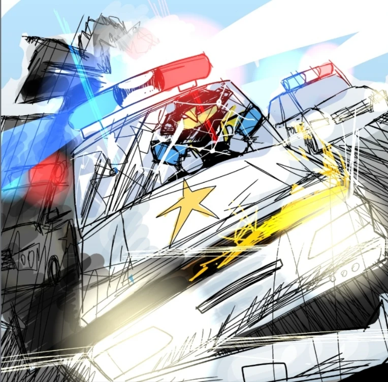
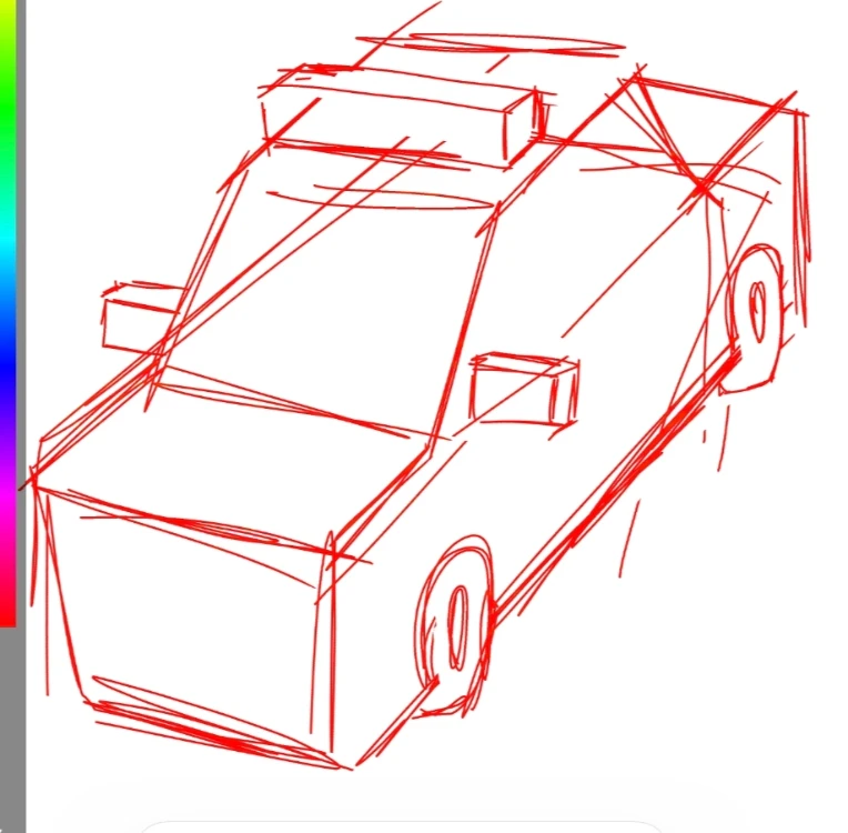
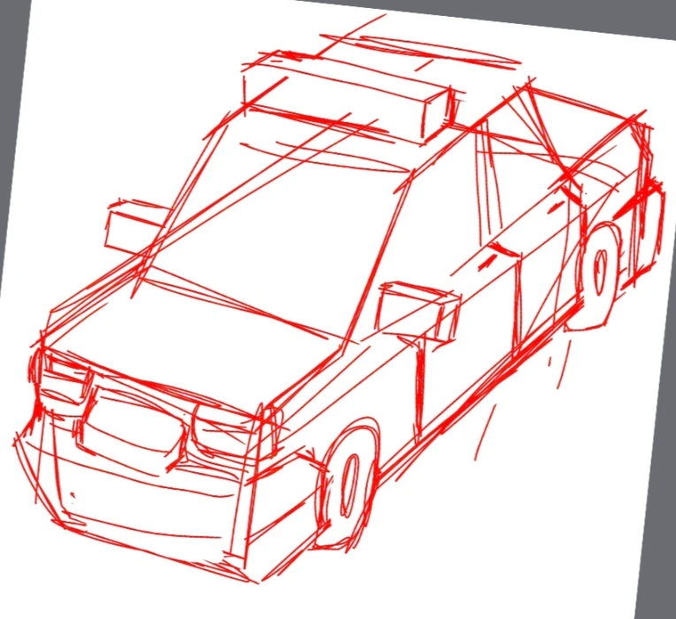
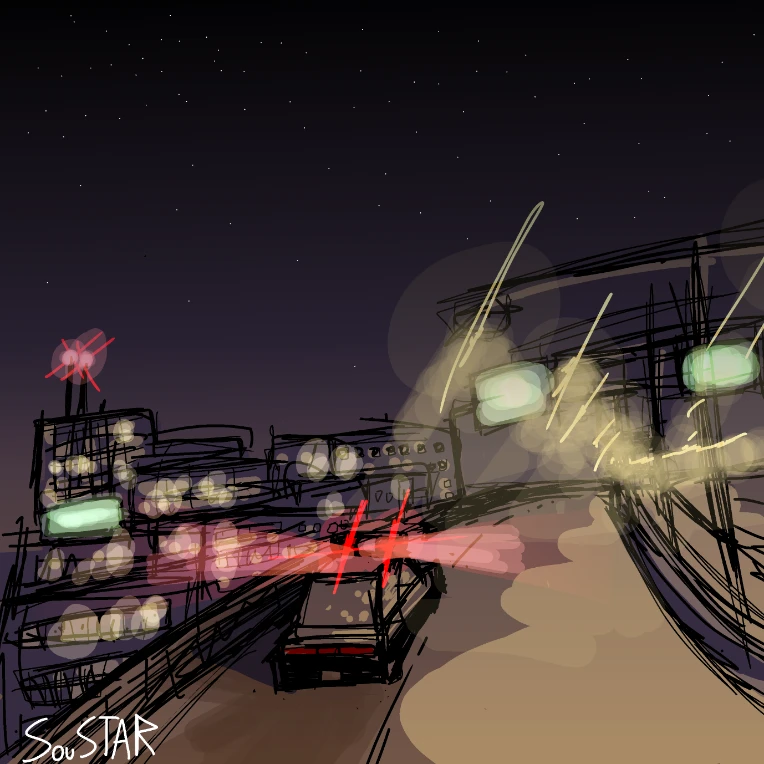
I drew the police car!
I added the drafts too :3

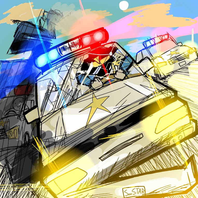
I drew the police car!
I added the drafts too :3
Nevermind it's actually low effort so I'll post it here
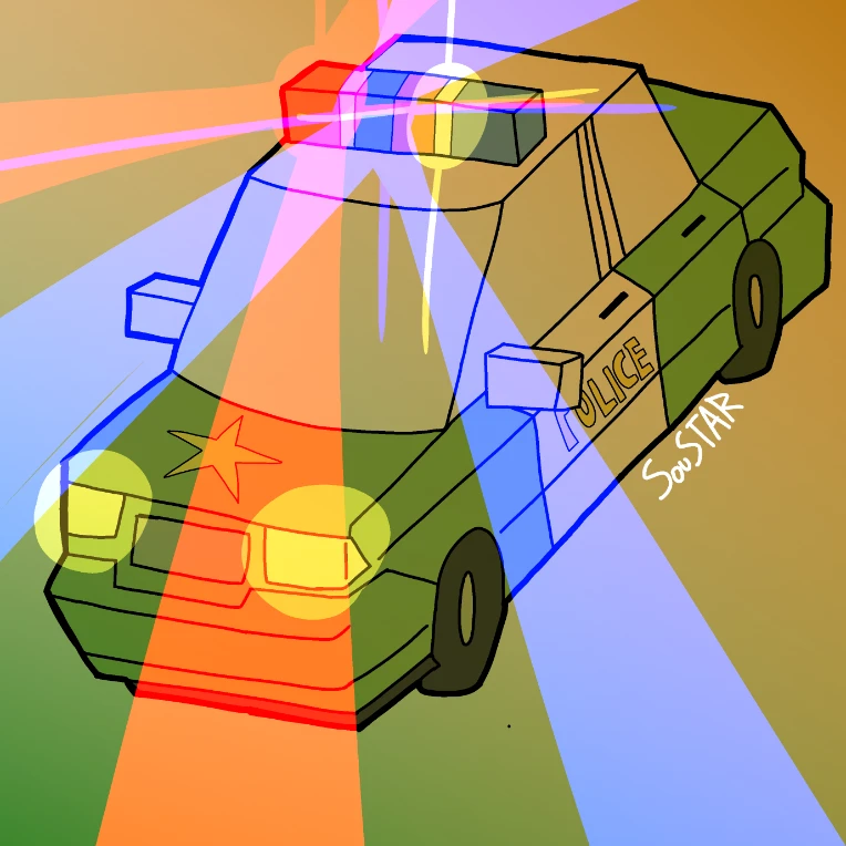
I think I'll work on it a bit longer before uploading it because it looks awful especially the background gradient
I might finish it tomorrow
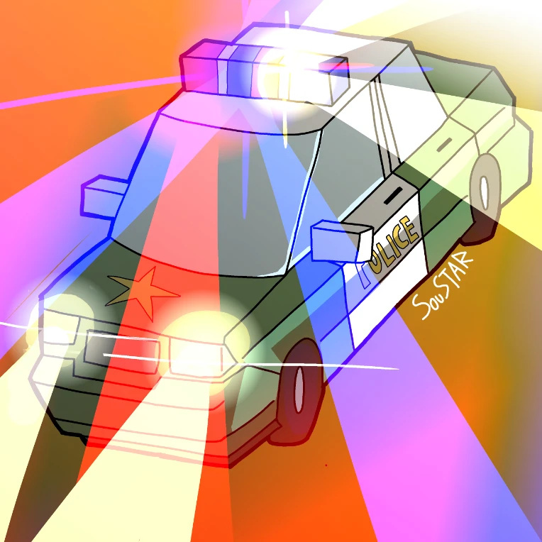
I'm a bit experimenting with lights because I want the next Jenn art to have a lot of flashing lights and everything.
I don't know, maybe I've gone a bit overboard with the lights? I feel like how the light is diffusing doesn't make sense.
Also, I might redo the lighting on the car. Having a crude white light when the general color is orange doesn't make sense either + it's ugly.
Please tell me what you think about it, and any suggestions and criticism please!
I will make some changes.
Thank you! :3
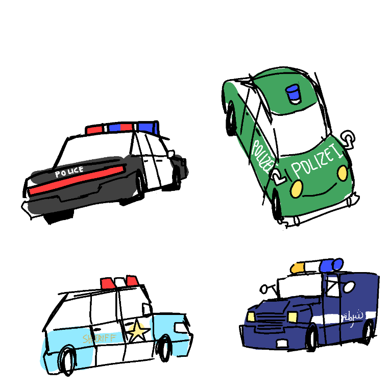
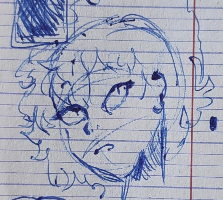
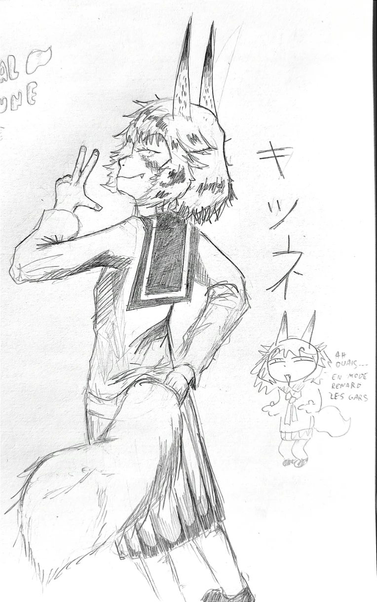
Here's some doodles I made in class :3
Practicing my 90s /realistic style!
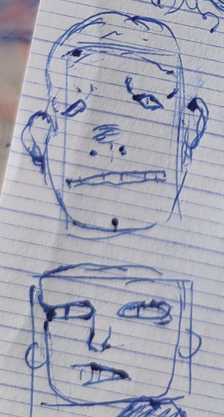
Experimenting with a new style :3
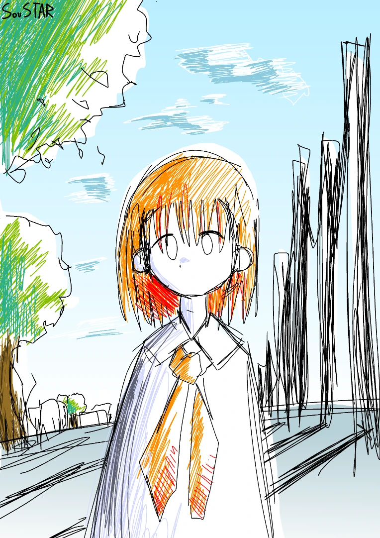
I also made 2 other drawings, so it make it 4 today!!! :D
Go check them out !!!! :3
I finally drew Magical Kitsune, in my retro style!
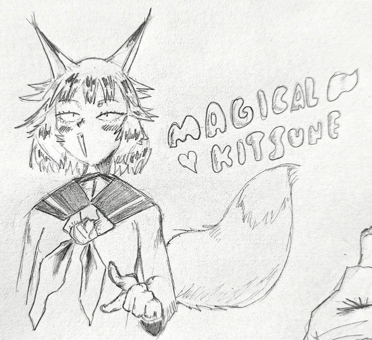
RETRO!!!!!
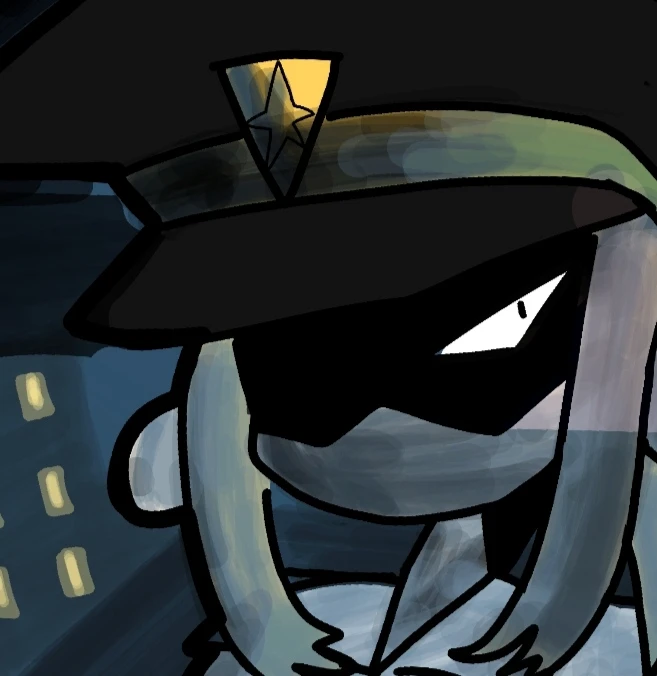
Working on a new shading/lighting technique.
Still a WiP!
Tried a new shading/lighting technique, by varrying the colors opacity!
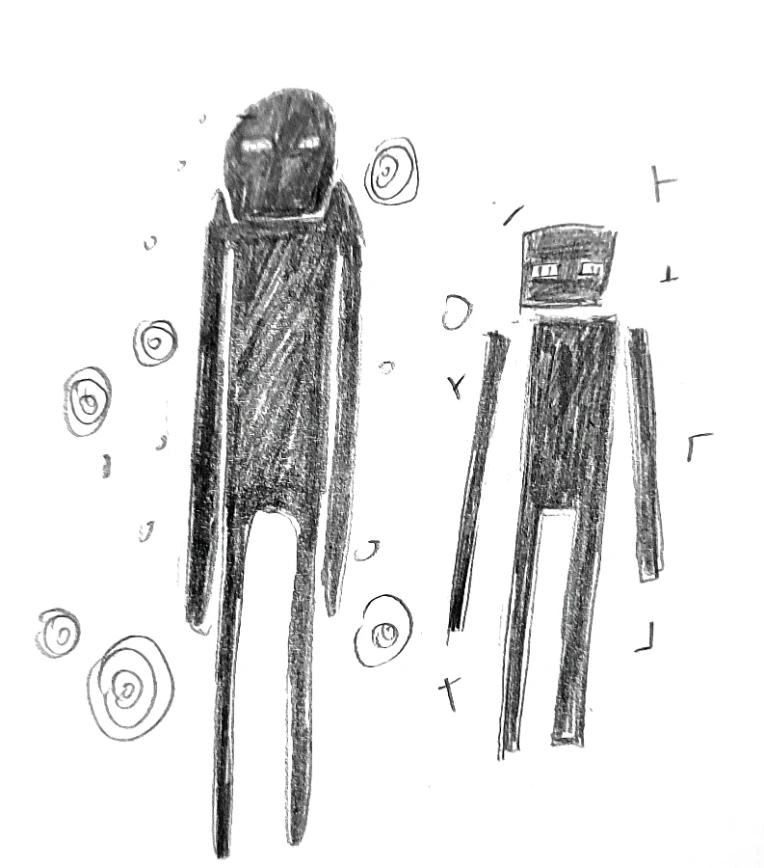
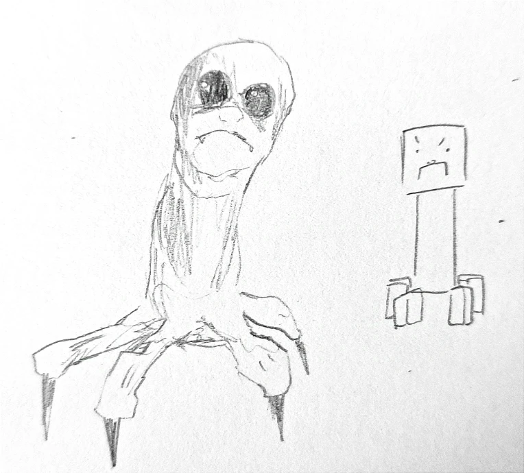
I drew an Enderman and a Creeper, how I see them and in a cute style :3
Retried to make some character design for fun, like I did for some time :3
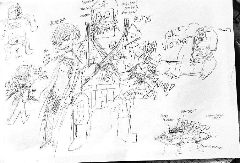
They're the 2 last cops in a mega-city abandoned by the government. Pretty much every crime organization settled in, like cartels, mafias, gangs, etc...
Brutus is a (not) recovering drug addict, who have a caveman like demeanor. He hates loud noises, unless it come from him.
Veneza was once a hooker. She's a bit more rational than mr caveman. She got a bit of that "dark edgy" behavior, but Brutus don't like complicated words, so she gets the tonfa too.
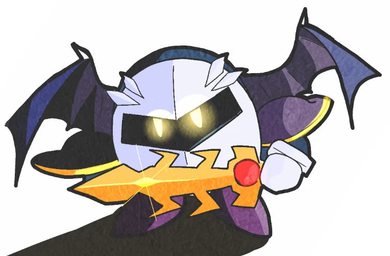
At 11/22/24 10:02 AM, SouSTAR wrote:@Gekkotsuki
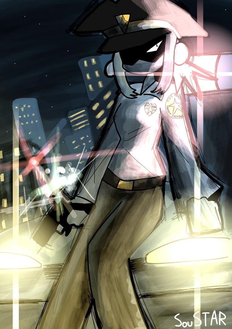
It's here! Thank you for your request!
https://www.newgrounds.com/art/view/soustar/meta-knight
Wow. I don't even know what to say, honestly. This looks awesome. Great work, I love it.
(Also, thank you for taking my request. I feel 'honored'.)
At 11/22/24 10:18 AM, Gekkotsuki wrote:At 11/22/24 10:02 AM, SouSTAR wrote:@Gekkotsuki
It's here! Thank you for your request!
https://www.newgrounds.com/art/view/soustar/meta-knight
Wow. I don't even know what to say, honestly. This looks awesome. Great work, I love it.
(Also, thank you for taking my request. I feel 'honored'.)
My pleasure!!
*:・・゚(◕ヮ◕)*:・゚*
At 11/23/24 02:11 AM, SouSTAR wrote:Should I post this in the portal?
absolutely! it's art, after all
At 11/23/24 02:42 AM, chaoticallyGeneric wrote:At 11/23/24 02:11 AM, SouSTAR wrote:Should I post this in the portal?
absolutely! it's art, after all
Okay! :D
At 11/23/24 02:42 AM, chaoticallyGeneric wrote:At 11/23/24 02:11 AM, SouSTAR wrote:Should I post this in the portal?
absolutely! it's art, after all
I posted it but there's a huge blank space so i gotta draw some cats in here and I'll update it XD
At 11/23/24 02:11 AM, SouSTAR wrote:Should I post this in the portal?
Go for it.

Not super conveiced about his design. I began by drawing the short comic strip and just draw him on a whim, without putting too much thought on him.
Then I drew him a second time
This one
And I saw that his face didn't match. So I went and actually am trying to come up with a good design.
I feel like the top right one is better
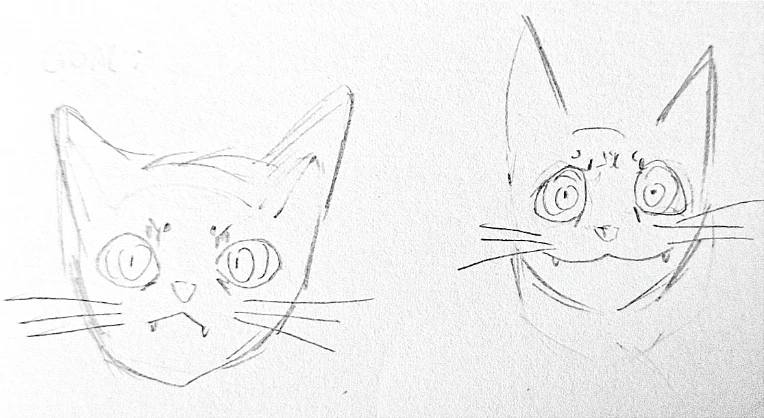
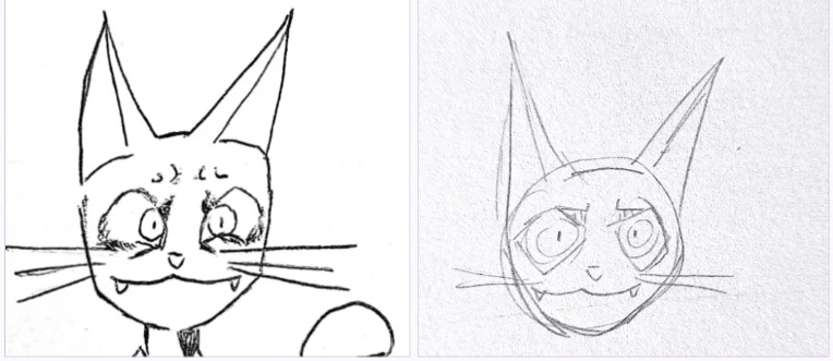
What do you think?
Bobtails (1pic) are japanese and Singapuras (2nd pic) come from singapor
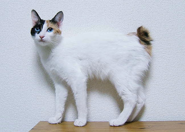
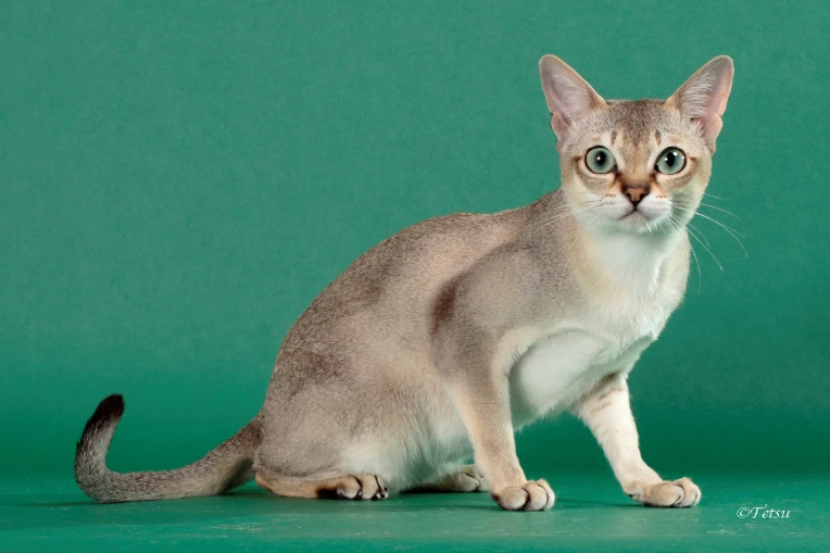
But my character is japanese and doesn't look like its breed...
Wtf am i doing
At 11/24/24 06:15 AM, SouSTAR wrote:Not super conveiced about his design. I began by drawing the short comic strip and just draw him on a whim, without putting too much thought on him.
Then I drew him a second time
This one
https://www.newgrounds.com/art/view/soustar/singapura
And I saw that his face didn't match. So I went and actually am trying to come up with a good design.
I feel like the top right one is better
What do you think?
Both the top right and bottom left are great designs and I think they sell what your going for when it comes to his personality and character the best. I feel like the top left while it isn't bad it isn't the most expressive looking design which could lead to some issues with conveying certain emotions without having to go super off model. I'd suggest making a couple more drawings of him with various expressions and poses to help make it easier to see what parts of his design need to be fixed or changed to make it look just right.
I finally decided on a good design for Singapura, I think.
I also drew some other characters. I want to get out of my comfort zone. I would gladly take criticism/advice!!!
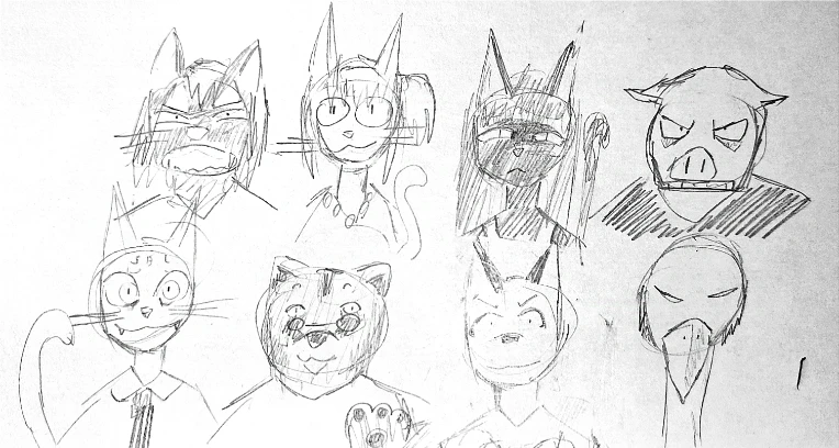
At 11/24/24 08:50 AM, SouSTAR wrote:I finally decided on a good design for Singapura, I think.
I also drew some other characters. I want to get out of my comfort zone. I would gladly take criticism/advice!!!
These all look great!
At 11/24/24 10:11 AM, ChronoNG wrote:At 11/24/24 08:50 AM, SouSTAR wrote:I finally decided on a good design for Singapura, I think.
I also drew some other characters. I want to get out of my comfort zone. I would gladly take criticism/advice!!!
These all look great!
@ChronoNG thank you!!! :D