At 7/19/23 01:26 PM, JJBolton635 wrote:This forum sounds interesting.
I have these artworks if anybody wants to comment along with other works on my Art page if anybody is interested:
https://www.newgrounds.com/art/view/jjbolton635/fluffy-dog
https://www.newgrounds.com/art/view/jjbolton635/just-a-nudge-title-and-end-card
https://www.newgrounds.com/art/view/jjbolton635/phobia-begone
https://www.newgrounds.com/art/view/jjbolton635/khao-eating-jam-on-bread-and-bun
[Critique These]
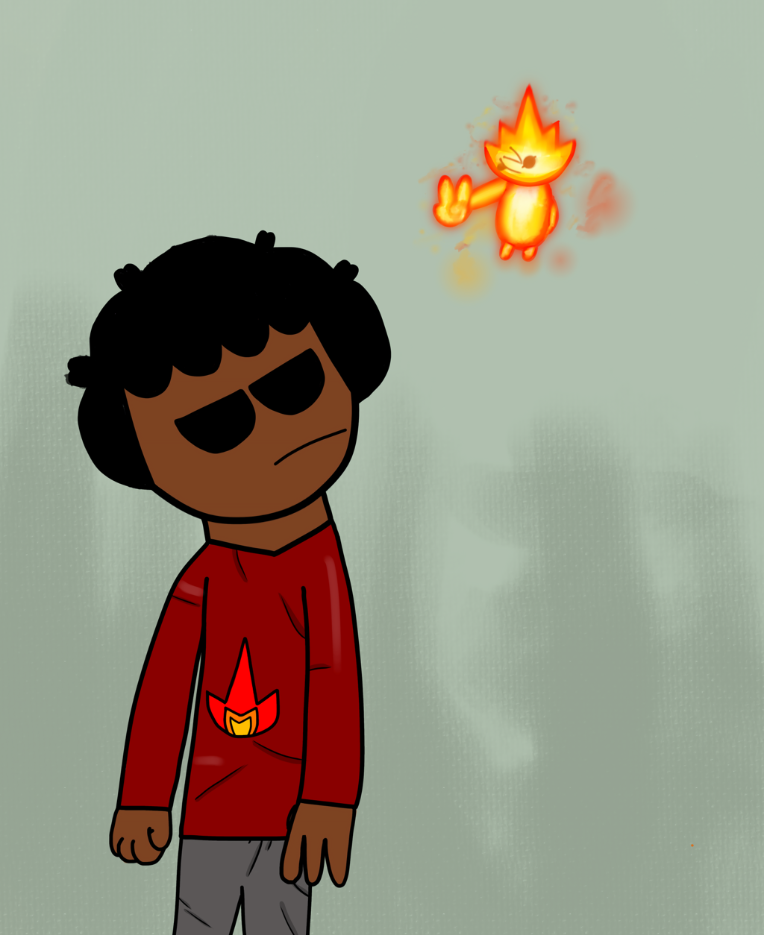
Piece #1: The head and face are very well drawn and look very full of life, but the body isn't as detailed, which makes it look like the face was cut and pasted. It might be better to keep the pen size consistent.
Piece #2: The lack of lines looks pretty good, but in the first part you could add shading to the dog's legs. Also in the first part, the cat is leaning in kind of an odd way. His feet should be flat on the ground, and it would be a fun detail to show that he has to bend around the dog's belly in order to be seen. The second part has much more dynamic looking poses, and does a good job telling a story.
Piece #3: I really like the background. The dog's tail doesn't really align with his butt and leg, making it look a little awkward. Also, the cat's arm with the flag looks kind of stiff. They could also be better centered in the piece. Aside from that, the upper anatomy for the dog is pretty good.
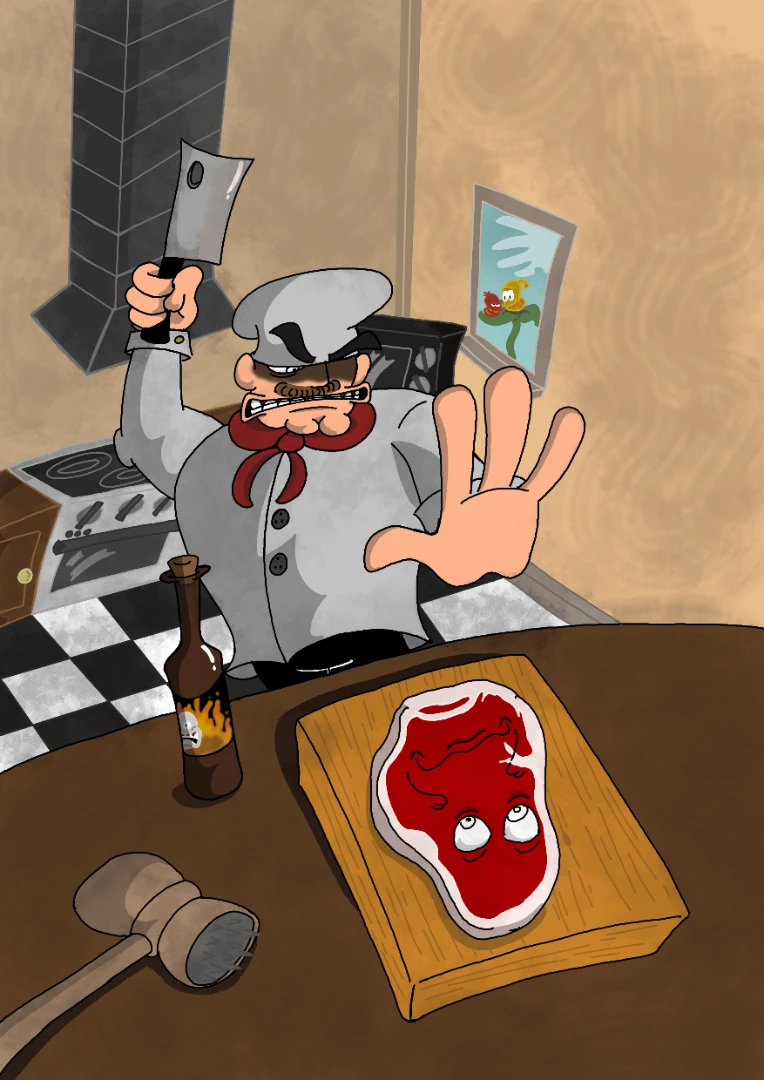
Piece #4: The anatomy looks pretty solid for the most part, except the tail looks like it was an afterthought, as it's angle makes the position of the buttcrack a little jarring. It might help to remove either the tail or buttcrack, or draw the tail at a different angle. Also the bread and knife sort of look like clipart, and the jelly on the bread in his mouth looks like a sticker. I like the way the bread flops, it's a nice detail.
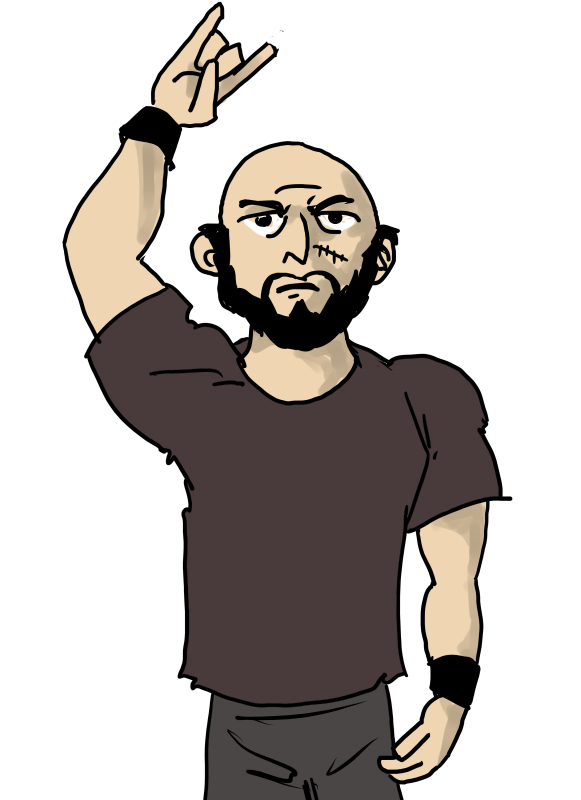
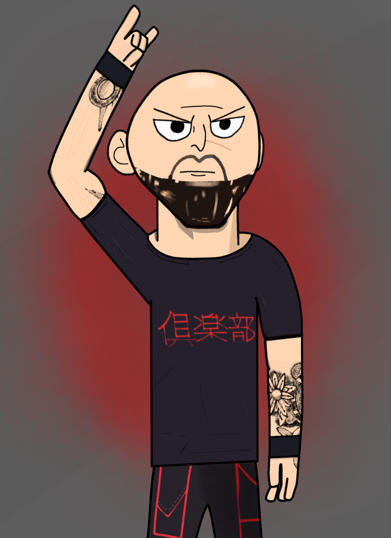
Overall, you're pretty good at drawing anatomy in such a simplistic style, but the bodies should have enough detail to match the face, and the lines should stay a more consistent size. There's also a lot of room to play with colors; for example the red shirts are very bright juxtaposed to everything else, so picking a more muted color could help. You also seem to have an okay grasp of character design, particularly with shape. I got a pretty good feel for the character's personalities. Overall, I think you could make the smaller characters such as the purple cat more dynamically posed, and do more with composition and color ^_^


 [CALL ME] Here's a WIP that I plan to work on tomorrow (apologies for the quality, the piece is much sharper than what is presented here). Any suggestions on what I can add to? I'm trying to give this a bit of a cozy yet reclusive/clustered look but I feel like I suck at composition. Feel free to tear me apart!


 This is kind of a long shot but critique this.