At 9/12/05 03:46 PM, Nomader wrote:
I have a question - who rates the sigs?
Me and a few others, you'll see us around.
Yours is pretty good I like the desert theme to it. The camels on the dunes is nice and I like the tv lines on it. Font is good as well. I give it a 5/10.
At 9/12/05 11:37 PM, Derc-Tora wrote:
Rate This Plz
Christ, what his your resolution? I do like the windows theme for I am a Windows user. :) You kept the colours yet added your own effects to them which is pretty cool. Heh, looking at it, each different window reminds me of sponges for some odd reason. :S Pretty cool, plain at the same time. I give it a 6/10 or so.
At 9/13/05 05:23 AM, Newgrundling wrote:
Does anyone have any suggestions / comments for my new current BBS signature picture? Also, which font color do you prefer? The one I have, or this one, the red:
Hmm, hard too say. I like how the red stands out but I like how the yellow blends with the rest of the sig. Either way it's a tough call to make as to which one is better. But I like how you've made it. NG themed and such which is neat. I give it a 6/10.
At 9/13/05 07:35 AM, bred_4_abortion wrote:
Rate mine plz
Meh, the fetus doesn't fit the sig. If the colour of it all was different then maybe but otherwise it doesn't really. :/ The font, it's.... I don't really care for it. IMO it is way over used to the point of annoyance. The background is alright though. I give it a 4.5/10.
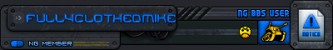
At 9/13/05 03:25 PM, FullyClothedMike wrote:
Oh.
I thought it would score higher...
2/10 from me.